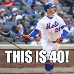
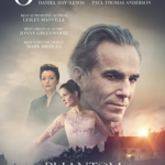
MLB Holiday Uniforms: Poppies, Patriotism and Pink

 I turned on the Yankees game last Friday night and was greeted with the sight of DJ LeMahieu in a camouflage hat and socks. I immediately checked my calendar. Was it Memorial Day weekend already, and I somehow didn’t realize it?
I’ve gotten so use to the barrage of MLB holiday uniforms throughout the season. Khaki and green that heralds in the Memorial Day holiday weekend. It was, however, Armed Forces Day last Friday, which means we got our camo fix a whole weekend earlier. Armed Forces Day, which is a new addition to the MLB holiday uniforms, is celebrated the third Saturday in May. It is a time “where citizens unite and honor military heroes for their patriotic support of the U.S.” and do their part by buying military-themed sports apparel. Of course, all proceeds from the sales of these soldier boy caps go to charities that support service members, veterans and military families.
Poppies for Patriotism
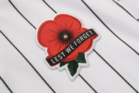
Fans are actually going to get a much more appropriate MLB holiday uniform homage for Memorial Day. Players’ uniforms will feature a simple poppy patch with the words “Lest We Forget” on the upper left part of their jersey and a Memorial Day patch on the side of their caps. Soccer players in the English Premier League have been wearing poppies on their jerseys in honor of Armistice Day in November since 2003.
The poppy is the traditional way to honor fallen soldiers. It came to symbolize the blood shed during battle after the publication of Lt. Colonel John McCrae’s poem “In Flanders Fields” in 1915. The American Legion adopted it as the official flower to memorialize those who fought and died during war in 1920. I remember my parents buying paper poppies from the veterans groups that would sell them outside the supermarket. My Dad was a decorated World War II vet, so we never passed them by.
These special jerseys will not be sold to the general public. They also will only be worn on Memorial Day unlike the Independence Day onslaught of stars and strips that will assault our eyes for three whole days.
There is nothing subtle about the July 4th (through 7th!) hats and socks that players will be wearing. The teams will have one of their historic logos on the front of their hats with a stars and stripes theme. It basically looks like the flag threw up on their logo. Although I do like the Cubs version, which has their cubby bear set in the middle of the C. It nicely offsets all that patriotic patterning.
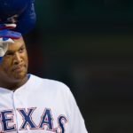
Most of the logos are wider than usual so they can cram the stars and stripes pattern in. This has resulted in the Texas Rangers T looking like a double-sided hangman’s gallows. I admit I do kind of like the special socks’ fireworks design, but in general I miss the days when a simple American flag on the side of a hat or arm sleeve would suffice as a way to recognize the holiday.
The Blue Jays will wear their red jerseys and a red hat with a prominent maple leaf logo for Canada Day on July 1. Much like Canadians themselves, these unis are understated and appropriate.
Pink is for Boys
Players wore pink-billed hats and pink socks in honor of their Moms and breast cancer awareness for Mother’s Day weekend. I love seeing the guys in pink. I personally think the color looks great on men and find the whole color to represent gender symbolism pretty moronic.
In fact, pink and blue were not used as gender signifiers until just before World War I. In a June 1918 article in the trade publication Earnshaw’s Infants Department (a trade magazine I wrote for albeit many, many years after 1918) “The generally accepted rule is pink for the boys, and blue for the girls. The reason is pink, being a more decided and stronger color is more suitable for the boy, while blue, which is more delicate and dainty is prettier for the girl.”
This year’s pink was a tie-dyed version that looked like something you’d find on a puff paint sweat suit worn by one of the Golden Girls. It’s hokey, but I love how much some of the players get into the wearing ‘o the pink. Yankees outfielder Clint Frazier gets the prize for this year’s best tribute thanks to his cleats, which featured his Mom’s cats. (I love a cat guy.) Overall, Frazier’s shoe game is totally on point as he puts cleats on some of the trendiest Nike sneakers.
Father’s Day will continue the tie-dye trend with powder blue to honor Dad and raise awareness of prostate cancer. While the pink version for Mom was pretty bad, these are even worse. The blue is on the crown of the hat instead of the bill so there’s much more ugliness front and center. These hats will look great with your zubas and Skechers. Much of ’90s fashion has come back in style, so maybe MLB is hoping Dad will either want to be on trend or feel nostalgic for the days of Power Rangers and pagers.
While I consider myself a purest when it comes to baseball uniforms, I have to admit I do enjoy seeing the schemes for the MLB holiday uniforms as a way of hawking their wares each season. Still no word yet on Players Weekend. So stay tuned for more hideousness …